Wednesday, 27 March 2013


Friday, 22 March 2013


Tuesday, 19 March 2013


Friday, 1 March 2013

Friday, 22 February 2013

Tuesday, 19 February 2013
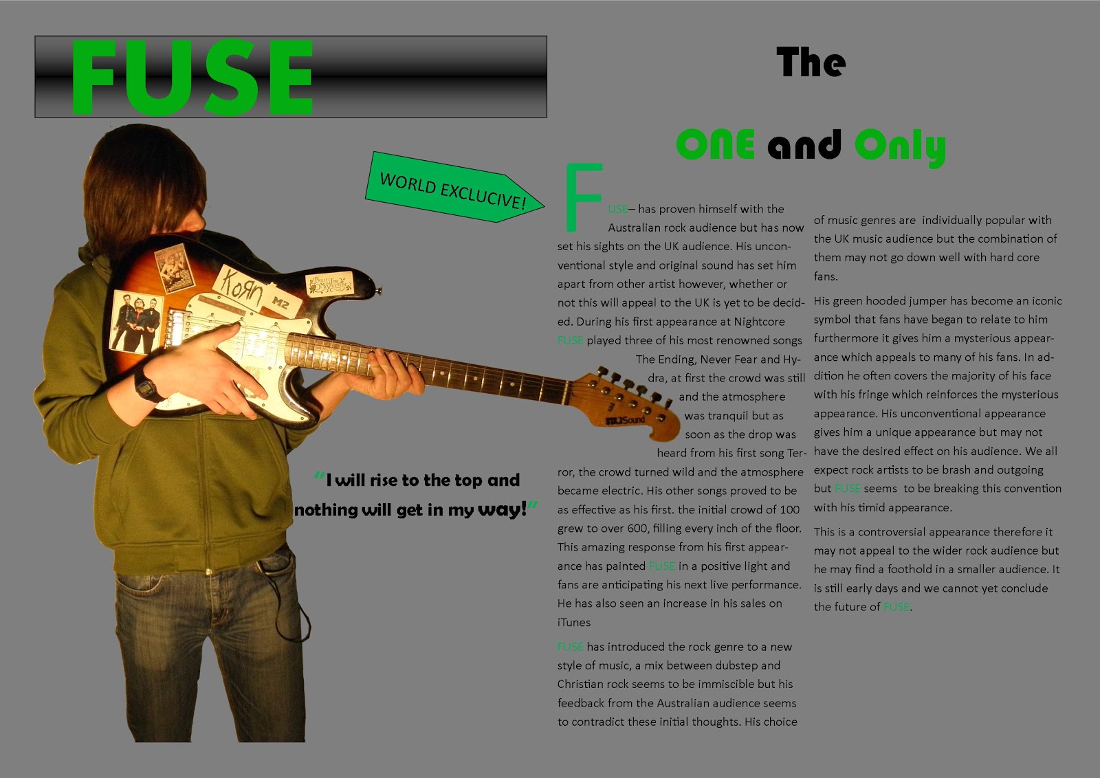
contents page feedback
- the colour scheme throughout the page is good and only three colours are used.
- i like the issue subscription at the bottom of the right corner and i think it is a good touch to the contents page.
- the images and texts used are conventional and they are layed out like a contents page should be.
- i think the colour does work well but the text could be a different colour maybe
Peer Feedback on Contents Page
Multiple images on the contents page. I like the use of the different front covers. Also, the cover scheme is strong, making the text bold and easy to read.
Could some texture, gradient or some drop shadows be applied to some areas to add some depth?
Luke Hallett
Could some texture, gradient or some drop shadows be applied to some areas to add some depth?
Luke Hallett
Saturday, 26 January 2013

Friday, 25 January 2013

Friday, 18 January 2013
3 different contents page layouts


Friday, 11 January 2013

Wednesday, 9 January 2013
Tuesday, 8 January 2013

Subscribe to:
Comments (Atom)